
Redesigning the case-management workflow 60+ teams live in.
- ROLE
- PRINCIPAL PRODUCT DESIGNER
- COMPANY
- Dell
- TIMELINE
- 2023
- SCOPE
- Enterprise workflow redesign · Quantitative usability testing · Information architecture · Rollout & change management

CONTEXT
Dell’s internal “airport” — JET routes and manages cases across 60+ teams on Salesforce Lightning, and powers services behind dell.com. Internal, but load-bearing.
- Salesforce Lightning
- 60+
- Teams served
- 130K
- Employee org
- Load-bearing internal tool

THE CHALLENGE
This airplane took a wrong turn — three problems taxed every case, and the fix had to be surgical inside Salesforce Lightning.
High case rejection
Routing issues bounced cases back and multiplied the work.
High cognitive load
Confusing, complex forms taxed every user on every case.
No personalization
No use of user data to tailor or speed the experience.
WHAT I DID
Ran quantitative usability testing
A structured before/after study — think-aloud, screen recording, success/errors/time/ignored fields.
Redesigned for clarity within Lightning
Reworked IA, field prominence, progressive disclosure and errors — cutting the noise.
Measured the redesign vs. the original
Re-ran the same script on the new flow — validated with numbers, not opinion.
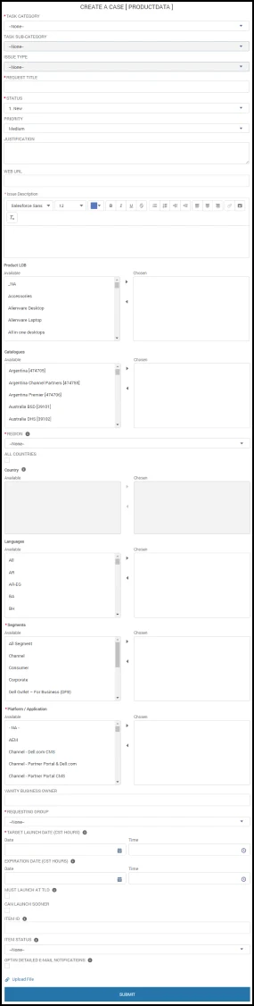
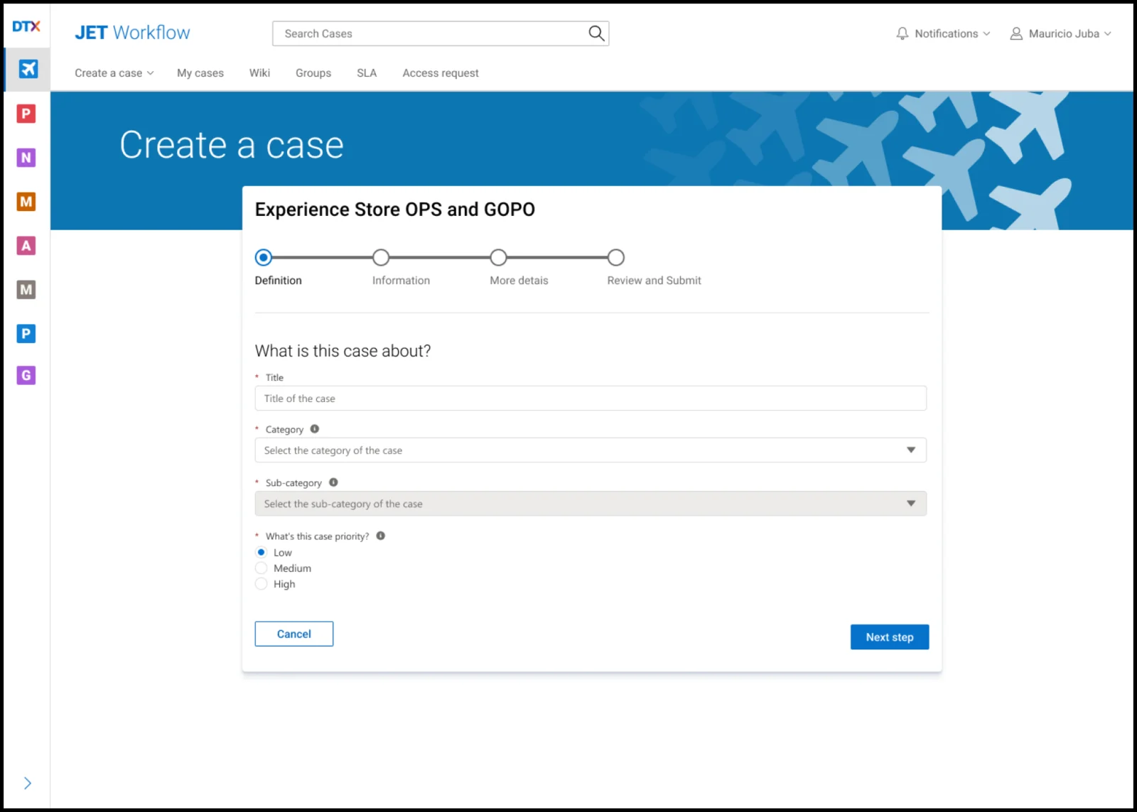
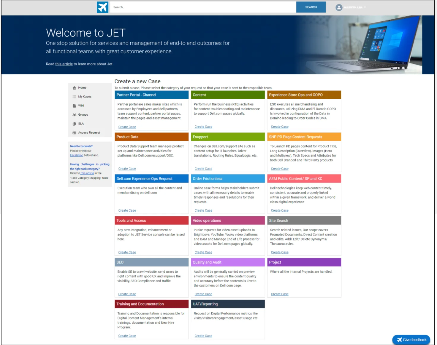
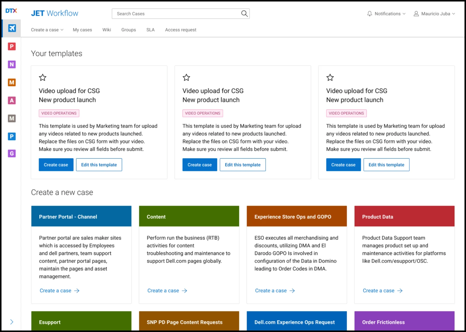
Same platform, fewer decisions: the sprawling single-page form became a four-step flow that hides optional fields and confirms before submit — and the category cards turn an expert’s shortcuts into something every team can use.
THE PROCESS
The UX strategy and discovery for JET, mapped end to end — from interviews to a prioritized backlog.
UX ROADMAP
22Q3 → 23Q1
Observation & Interviews
22Q3 · REQUESTERS22Q4 · AGENTS- Interviewed users across distinct demographics and JET proficiency — mainly by shadowing real usage.
- Traced the journey from when the need appears to case submission, noting how users felt along the way.
GUIDED QUESTIONS
- Understand demographics.CONTEXT
- How are the user’s job role and work related to JET?DESCRIPTIVE
- What are the first steps the user takes before even starting on JET?DESCRIPTIVE
- How is the first contact with the tool?BEHAVIOUR
- What types of cases is the user familiar with?DESCRIPTIVE
- How does the user fill in the new-case form?BEHAVIOUR
- What are the user’s concerns when creating a case?DESCRIPTIVE
- How does the user interact with a case after it’s created?GENERATIVE
- What issues is the user afraid to pass on once a case is created?REACTIVE
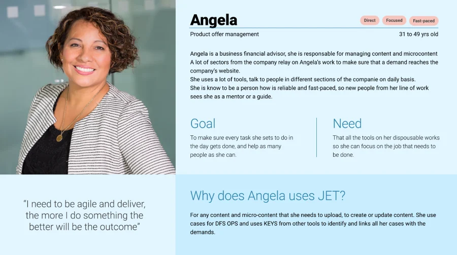
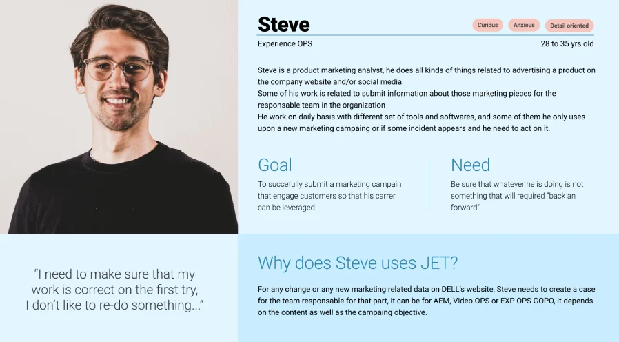
Personas
22Q3 · REQUESTERS22Q4 · AGENTS- Classified users from the interviews, then grouped them into two–three personas where journeys and feelings aligned.
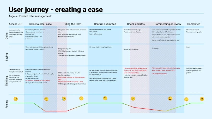
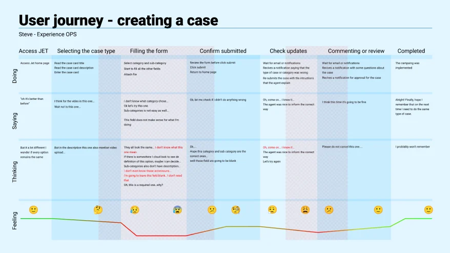
User Journey
22Q3 · REQUESTERS22Q4 · AGENTS- Drew the AS-IS journey per persona to pinpoint pain points — and a baseline to measure new-feature ROI against.
Heuristics Evaluation
22Q4 · REQUESTERS- Ran a Nielsen heuristic evaluation to catch anything degrading the JET experience.
10 USABILITY HEURISTICS · NIELSEN
01VisibilitySOMELittle feedback when creating a case.
02MappingTOO MANYGeneric case types, categories and sub-categories confuse groups about terms.
03FreedomSOMENo review/confirmation — a case created wrong can’t be deleted.
04ConsistencyTOO MANYInconsistent warnings, color code, headers and nav from page to page.
05Error preventionTOO MANYNo review step; critical actions fire with no confirmation.
06RecognitionTOO MANYField positions shift for the same content depending on case type.
07FlexibilitySOMEFew options to personalize or speed up everyday tasks.
08MinimalismTOO MANYExtensive forms; dense 3-column pages bury critical info.
09Error recoveryNONENo notable issues found.
10Help & docsSOMENot all fields have tooltips; no glossary for option-field terms.
Benchmark Baseline
22Q4 · REQUESTERS23Q1 · AGENTS- Gathered current-state metrics to compare against industry standards and future iterations.
REQUESTER BENCHMARK
QUT · 36 PARTICIPANTS · REMOTE MODERATED
Search for a specific case
Most users skip filters — the screen is mainly for checking the last case’s status and cloning an older one.
TIME ON TASK
1:06EASE /7
4.4SUCCESS RATE
73%USE FILTERS
6%Create a case
Cognitive load is too high to recall even the last case — and almost half the form is ignored.
TIME ON TASK
3:13EASE /7
4.0SUCCESS RATE
58%% IGNORED FIELDS
40%Interact with case & agent
Users ignore case comms unless the status flags On Hold / Edits Needed — they prefer email or Teams.
TIME ON TASK
2:01EASE /7
5.0SUCCESS RATE
79%Assumption Board Review
22Q4 · REQUESTERS23Q1 · AGENTS- Validated the discovery assumptions with a CSD matrix.
UX & Product Backlog
22Q4 · REQUESTERS23Q1 · AGENTS- Prioritized issues with PM and stakeholders, and proposed a new journey for each problem statement.
OUTCOMES
Same platform, fewer decisions — and the numbers moved (full before/after below).
Task success +29 pts
58% → 87% on the very same usability script.
Ignored fields −75%
40% → 10% — the clearest sign the IA got better, not just the visuals.
WHAT I LEARNED
IA beats styling
On a constrained platform, structure moves the numbers more than surface.
Evidence over taste
Before/after testing makes a redesign a matter of evidence.
Rollout is design
At 60+ teams, change management is part of the work, not an afterthought.
Results
TASK SUCCESS
EASE OF USE (/7)
TIME ON TASK
IGNORED FIELDS
Measured with the same usability script, before vs. after the redesign.
TEAMS SERVED
EMPLOYEE ORG
PROJECT
SUCCESS LIFT
“On a constrained platform, information architecture moves the numbers more than surface styling.”